Analyzing Access to Electricity Through Data Design Process
Data visualization is about communicating information to the right audience in the right way so that they can understand and internalize its meaning — Tyler Wolf
The quote above is from Tyler Wolf, the Industry Leader for the Data Visualization module that we had in Hyper. As a Data Analyst, being able to visualize the findings from the data analysis is important. After doing all the cleaning and the analysis, it would be a big miss if the audience don’t understand what we’re trying to convey.
In one of the lectures in the Data Visualization module, we had the pleasure of having Evelina Judeikytė, an independent Information Designer based in Paris, coming to Stockholm to facilitate a full-day workshop in Data Design Process.
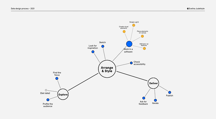
In my understanding, Data Design Process is the entire process of designing and delivering a compelling story of the data findings through exploring and analyzing the data. Her method contains 3 major steps: Explore, Arrange & Style, and Deliver. Each step contains actions that will guide us through the entire process. The image below is the mapping of the steps.

Explore
Step 0: Setting the scene
This is actually the very first thing that needs to be done before even getting the data. What is our role in this? What’s the end goal? While it’s important to keep an open-mind when doing data analysis, especially exploratory data analysis, more often than not we’ll find ourselves analyzing data related to our role.
In the workshop, the scenario was that we were a newly appointed Minister of Energy, and the goal was to make a report on access to energy across the world to the government, to encourage them to make investment.
Step 1: Profile the audience
To make sure the audience can understand what we are going to communicate to them, we have to first understand the audience. Who are they? What do they care about? How familiar are they with the topic? How comfortable are they with graphs and charts? The intention is to convey a meaningful message that is easy to digest.
Step 2: Get data
Once we understand the audience, we need to start getting the data. This could come from various sources, for example internal company data, surveys, getting data from websites such as Kaggle, and internet scraping.
In the workshop, we were given a dataset about access to electricity globally, categorized into urban and rural areas, covering the years 1999, 2009, and 2019.

Step 3: Find the focus
This is where we start exploring the data. To help with the exploration, it’s good to remember the 5W: What (are the phenomena, actions to take, …), Who (are the affected, collected the data, …), When (was the data collected, is it still relevant, …), Where (did the phenomena happen, was the data collected from, …), and Why (did the phenomena happen, was the data collected, …). Having these questions in mind can help finding what we want to focus on.
In this case, I used Python with pandas library in the attempt to find something interesting. First, I imported the file as a pandas dataframe to check how it looks
import pandas as pddf = pd.read_csv('World Bank Indicators - Data.csv')
df

Being in Sweden, I checked how it looks in Sweden:
df[df[‘Country Name’] == ‘Sweden’]
Well, Sweden has always had 100% access to electricity since 1999, so nothing interesting to talk about. But after exploring for a while, I found that there are 3 countries that have less access to electricity compared the previous decades.
df[(df[‘1999’]>df[‘2009’]) & (df[‘2009’]>df[‘2019’])]
Arrange & Style
Step 4: Look for inspiration
Sometimes you might know exactly what you want to do, but in some other times that is just not the case. Luckily, the internet is an excellent place to look for inspiration. Some websites that can be helpful to look into:
Initially, I wanted to make a simple bar chart for the three countries in my findings. However, after getting some inspiration from some of the websites above, I had an idea of focusing on just one country (Djibouti) and make it really obvious that the situation is getting worse.
Step 5: Sketch
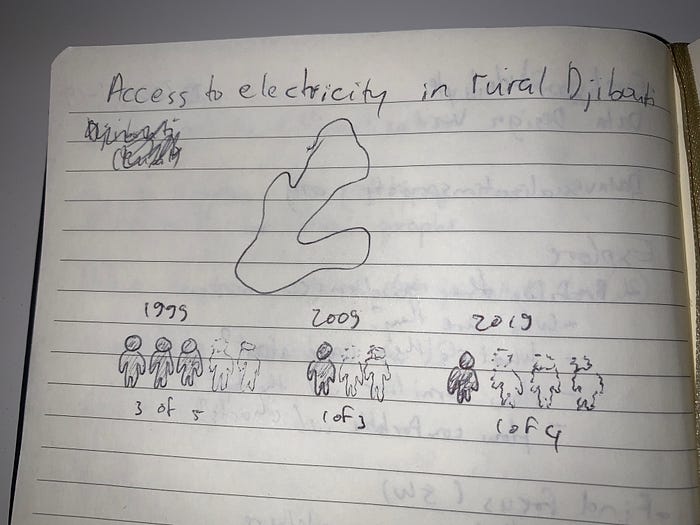
Before starting to work in a software, it’s important to sketch the visualization with pen and paper. This helps visualizing what we have in our head without being constrained by the software.
Being not good at drawing at all, this step was quite daunting for me. However, this proved to be a good exercise. Since I was not bound to what a specific software can and cannot do, I was freely sketching on a piece of paper. Something that I learned was that we don’t have to be a good drawer to start sketching. The whole point is to visualize our thoughts to the paper, not to draw the final design.

Step 6: Work in a software
After we did the pen and paper sketch, it’s time to start working in a software. Since we already know how it will look like, we can choose the most suited tool for the job, be it Excel, Python, Tableau, Datawrapper, Figma, Illustrator, or for a complex visualization you could go crazy with D3 (which all the lecturers from this module were expert in).
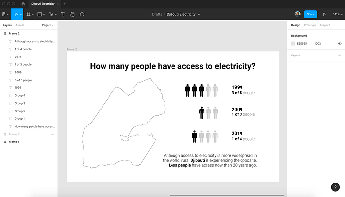
Based on the sketch that I drew, I thought Figma was the most suited tool for the job. I did some googling to find the Djibouti map and the person icon and put everything together.

Step 7: Check accessibility
Often overlooked, this part is actually crucial. When creating data visualization, it’s important to make it inclusive. Make sure the text is readable, check the color contrast, and take color blindness into account. Color blindness is more common than what people might think. For every 12 men, 1 of them is color blind, and for every 200 women, 1 of them is color blind.
Deliver
Step 8: Ask for feedback
Before publishing the visualization, it’s a good practice to ask for feedback. Ask someone where their eyes are drawn first, what they think the message is, what works well, and what is unclear or misleading.
I got the feedback that the measurement confuses the brain because, even though it’s technically correct that less people are getting access to electricity, the number of total people fluctuates (5 in 1999, 3 in 2009, and 4 in 2019).
Step 9: Iterate
Based on the feedback, iterate the design and ask for feedback again. If needed, look for more inspiration. Data Design Process is an iterative process.
Step 10: Publish
Finally, it’s time to publish the final design. It could be through presentation, publishing it online, or any appropriate channel for the occasion.
Without further ado, this is my final visualization.

Through the step-by-step guidance shown in the workshop, you get to practice a design process that is centered around the audience. By communicating the message with a meaningful data visualization, they can fully understand the information and internalize its meaning. I hope you find this process useful. If you’re interested in working with the data yourself, you could find the data here.
